
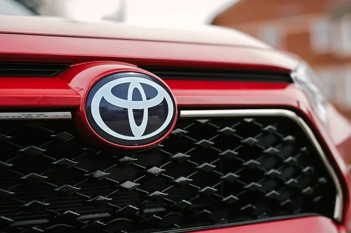
The Toyota logo features three overlapping ellipses that represent the unity of the customer, product, and technology. Designed in 1989, it reflects Japanese craftsmanship and global innovation. Understanding what is the logo for Toyota reveals how a simple mark tells a powerful brand story.
Every time you see a car on the road, you probably notice the emblem on the front grille or hood. That small graphic carries a lot of meaning. If you have ever wondered what is the logo for Toyota, you are not alone. Many drivers see it daily but never stop to think about why it looks the way it does. The answer is a mix of history, design strategy, and brand values.
Toyota is one of the most recognizable names in the auto industry. Its logo appears on sedans, trucks, and SUVs across the globe. Yet the mark is more than just a pretty shape. It tells a story about where the company started and where it wants to go. In this guide, we will break down the design, the meaning, and the history behind the emblem. You will also learn how the logo connects to the broader brand identity and why it has stayed relevant for decades.
Key Takeaways
- Simple Design, Deep Meaning: The three ellipses symbolize the seamless blend of customer, product, and technological progress.
- Japanese Roots: The logo reflects Toyota’s heritage, precision, and commitment to quality from its origins in Japan.
- Global Recognition: Its clean, modern look helps the brand stand out across markets while staying timeless.
- Evolution Over Time: The emblem shifted from the original block-style mark to the current elliptical design for better scalability.
- Brand Values in Visual Form: The logo communicates reliability, innovation, and continuous improvement without words.
- Consistent Across Models: You will see the same core emblem on cars, trucks, and SUVs, reinforcing brand unity.
- More Than a Graphic: The mark serves as a visual promise of durability, safety, and forward-thinking engineering.
📑 Table of Contents
The Current Toyota Logo and Its Core Design
The modern Toyota emblem is clean, simple, and easy to spot. It uses three smooth ellipses that overlap in the center. The overlapping area creates a subtle shape that looks like a capital T. This design works well because it is bold without being cluttered. Car manufacturers need logos that look good at many sizes. A mark must be clear on a tiny key fob and also on a large hood stamp. The Toyota logo handles both jobs with ease.
Why Three Ellipses Matter
The three ellipses are the heart of the design. Each loop carries a specific idea. Together, they show how different parts of the business connect. The first ellipse represents the customer. The second stands for the product. The third reflects technology and innovation. When these shapes overlap, they suggest that all three work as one. This idea matches how the company approaches vehicle development. Engineers, designers, and buyers all play a role in the final result.
The overlap also creates a sense of motion. Smooth curves feel modern and forward-moving. Sharp corners can feel stiff or old. By using rounded forms, the logo feels friendly and approachable. That matters because cars are personal items. People form emotional ties to their vehicles. A warm, balanced logo helps reinforce that connection.
How the Logo Works Across Materials
A strong emblem must survive different printing methods and surfaces. The Toyota mark appears on metal badges, plastic trim, websites, ads, and apparel. The simple geometry helps a lot. Clear lines stay readable even when the size drops. The overlapping ellipses also create a natural center point. That makes the logo easy to align on badges and graphics.
Design teams often test logos in black and white first. If a mark works in one color, it usually works in many. The Toyota logo passes that test. The shapes hold their meaning without relying on bright colors or complex details. That flexibility is a big reason the emblem has lasted so long.
What Is the Logo for Toyota Supposed to Represent
People often ask what is the logo for Toyota really meant to convey. The answer goes beyond shapes. The emblem acts as a visual summary of the brand’s priorities. It signals reliability, progress, and global reach. Those ideas matter to buyers who want a vehicle that lasts and improves over time.

Visual guide about Toyota logo three ellipses close up
Image source: thumbs.dreamstime.com
The overlapping ellipses also suggest unity. A car company does not build vehicles in isolation. It works with suppliers, dealers, engineers, and customers. The logo hints at that network. It shows that many pieces come together to create a finished product. That message is subtle, but it is there.
Connection to Brand Values
Toyota built its reputation on practical engineering and steady quality. The logo mirrors that approach. It does not try to be flashy or extreme. Instead, it feels balanced and thoughtful. That fits a brand known for dependable daily drivers and practical family vehicles. The mark supports the idea that the company values consistency over hype.
The design also hints at continuous improvement. The smooth curves can feel like forward motion. The overlapping shapes suggest layers working together. In auto manufacturing, small improvements add up over time. The logo quietly reflects that mindset. It says the brand keeps refining its work rather than standing still.
Global Appeal and Cultural Neutrality
A global brand needs a logo that travels well. The Toyota emblem does not rely on language or local symbols. That makes it useful in many markets. People in different countries can recognize the mark without needing an explanation. The clean geometry also avoids cultural traps. It feels neutral enough to work everywhere while still feeling distinct.
This kind of design is especially helpful for a company that sells many vehicle types. Sedans, trucks, and SUVs all carry the same core identity. A unified logo helps tie those products together. Buyers understand that each model belongs to the same family. That sense of family matters when people compare options in a crowded market.
The History Behind the Toyota Emblem
The current logo is not the first mark the company ever used. Toyota’s visual identity changed as the business grew. Early branding looked different from the polished emblem we see today. Over time, the company refined its graphics to match modern design trends and manufacturing needs. Understanding that evolution helps explain why the present logo feels so intentional.
If you want a deeper look at the symbol itself, you can explore our guide on what is the Toyota logo. That article breaks down the visual choices in more detail and shows how the emblem fits into the brand’s larger story.
From Early Branding to the Modern Mark
In the beginning, Toyota used simpler letter-based branding. The company needed a clear name mark that could be printed on parts, ads, and vehicles. As the business expanded, the graphics became more refined. Designers started thinking about how the brand would look on moving products, not just on paper. That shift pushed the company toward cleaner shapes and better scalability.
The move to the elliptical design came as the auto industry modernized. Manufacturers wanted logos that felt dynamic and international. Blocky letter marks still worked, but smoother forms felt more forward-looking. The Toyota emblem arrived at a time when brands were investing more in visual identity. The new mark helped the company present itself as a global player with a clear design language.
Why the Update Made Sense
A logo update is not just about looks. It often reflects business growth. As Toyota added more models and entered more markets, it needed a mark that could adapt. The three-ellipse design gave the brand a flexible tool. It could be used on small badges, large screens, and marketing materials without losing clarity. That practicality mattered as much as the style.
The update also helped separate the brand from older industrial imagery. A cleaner emblem feels more automotive and less like a factory stamp. That distinction matters when buyers compare brands. The logo needed to say that Toyota belongs in the modern vehicle market, not just in the history books. The new design made that point without shouting.
How the Logo Connects to Toyota’s Brand Identity
A logo works best when it matches the company behind it. Toyota’s brand identity centers on practical innovation, durability, and broad accessibility. The emblem supports those ideas through its calm, balanced look. It does not promise luxury for a few. It suggests dependable solutions for many. That distinction shapes how people read the brand.
The logo also fits a company that makes a wide range of vehicles. From compact cars to larger SUVs, the same emblem appears across the lineup. That consistency helps buyers understand the relationship between models. It creates a sense of order in a busy product range. People like brands that feel organized and clear. The logo helps deliver that feeling.
Visual Consistency Across Vehicles
One reason the emblem works so well is that it stays consistent. You see the same core shape on different vehicles and in different contexts. That repetition builds recognition over time. When people spot the mark, they immediately know the brand. Consistency also makes the company look confident. It shows that the brand does not need to change its identity for every new model.
This approach also helps with merchandising and marketing. The logo can appear on apparel, accessories, websites, and showroom signage. A stable visual identity makes those materials feel connected. Buyers notice that kind of polish. It suggests the company pays attention to details, which matters when people trust a brand with a major purchase.
Brand Trust and Recognition
Trust grows when people see the same quality signals again and again. The Toyota logo acts as one of those signals. It appears on vehicles that are known for long-term use and everyday reliability. The calm, steady design matches that reputation. It does not look chaotic or temporary. That visual stability helps reinforce the idea that the brand is solid and dependable.
Recognition also matters in busy environments. On a crowded lot or a fast-moving highway, a clear logo helps a vehicle stand out. The simple ellipses are easy to read at a glance. That quick recognition is valuable for a brand that wants to stay visible in many markets. It is one reason the emblem has become so familiar worldwide.
Common Misunderstandings About the Toyota Logo
Even a well-known logo can spark confusion. Some people think the mark has hidden symbols that are not actually part of the design. Others assume the ellipses mean something very different from what the brand intended. It helps to clear up these misunderstandings so readers can see the logo for what it is.
Does the Logo Hide a Secret Symbol
Some viewers try to find extra shapes inside the overlapping ellipses. That is a natural reaction because people like patterns. The design does create a T-like center, but that effect comes from the overlap rather than a hidden drawing. The main purpose is to show connection and motion, not to tuck in a secret message. Keeping the design open is part of what makes it so versatile.
Is the Logo Only About Japan
Another common idea is that the logo only reflects Japanese culture. The brand does have strong roots in Japan, and that heritage matters. But the logo was built for a global audience. It uses universal shapes instead of local imagery. That choice helps the mark work in many countries without needing translation or explanation. The brand’s origin is important, but the logo is meant to travel beyond one region.
Why People Sometimes Mix It Up With Other Brands
Car logos often share similar traits. Many use circles, shields, or clean letter marks. That similarity can make people second-guess what they are seeing. The Toyota emblem stands out because of its three-ellipse structure. Once you notice that detail, it becomes easier to tell apart from other marks. Paying attention to the overlap is the quickest way to recognize it with confidence.
Expert Insights on Why the Logo Still Works
Design experts often say that a good logo should be simple, memorable, and adaptable. The Toyota emblem checks those boxes. It uses a small number of shapes, which makes it easy to remember. It also scales well, which makes it practical for real-world use. Those qualities are why the mark has stayed effective for so long.
Another reason the logo works is that it avoids trends that fade quickly. Some designs look modern for a few years and then feel dated. The elliptical shape feels timeless because it is based on basic geometry. That gives the brand a stable look that does not need constant reinvention. In a fast-moving industry, that kind of stability is valuable.
What the Design Teaches About Branding
The Toyota logo offers a useful lesson for anyone interested in branding. You do not need a complicated image to communicate meaning. Clear shapes and thoughtful overlap can do a lot of work. The design also shows that a logo should support the business, not distract from it. When the mark fits the brand’s values, it becomes more than decoration.
This is why many people who study what is the logo for Toyota end up talking about more than graphics. They talk about identity, trust, and long-term thinking. The logo works because it matches a brand that focuses on consistency and improvement. That alignment is what makes the emblem feel right every time you see it on a vehicle.
Final Thoughts on the Toyota Logo
So, what is the logo for Toyota really telling us? It is telling us that the brand values connection, progress, and clarity. The three ellipses are simple, but they carry a strong message. They suggest that customers, products, and technology can move forward together. That idea fits a company built on practical vehicles and steady innovation.
The logo also shows how good design can last. It is easy to recognize, easy to use, and easy to trust. Those qualities matter in the auto world, where buyers look for signs of reliability before making a big decision. The emblem does not try to do too much. Instead, it stays focused and clean. That focus is a big part of its success.
If you look at the logo with fresh eyes, you can see why it has become so familiar. It is not just a mark on a hood. It is a small visual summary of a global brand. And once you understand the thinking behind it, the design feels even more purposeful.
Frequently Asked Questions
What does the Toyota logo symbolize?
The logo uses three overlapping ellipses to represent the customer, the product, and technology working together. It also suggests unity, motion, and continuous improvement.
Why does the Toyota logo have three ellipses?
The three ellipses were chosen to show how different parts of the brand connect. Their overlap creates a sense of integration and forward movement while keeping the design simple.
When did Toyota change its logo?
Toyota introduced the current elliptical logo in 1989 as part of a broader update to its visual identity. The new design was made to feel more modern and globally scalable.
Is the Toyota logo based on a Japanese symbol?
No, the logo does not rely on a specific Japanese character or local symbol. It uses universal shapes so it can work well across international markets.
Does the Toyota logo contain a hidden T?
The overlapping ellipses create a T-like shape in the center, but that effect comes from the design structure rather than a hidden image. It helps reinforce the brand initial without cluttering the mark.
Why is the Toyota logo so recognizable?
It is recognizable because it is simple, balanced, and used consistently across many vehicles and materials. The clean geometry makes it easy to spot at a glance, even from a distance.
1 thought on “What is the logo for Toyota and Why It Looks Like That”